19 Jul 2026
Graphical Tools Bettors Deploy to Chart Advisory Accuracy Across Varied Event Categories
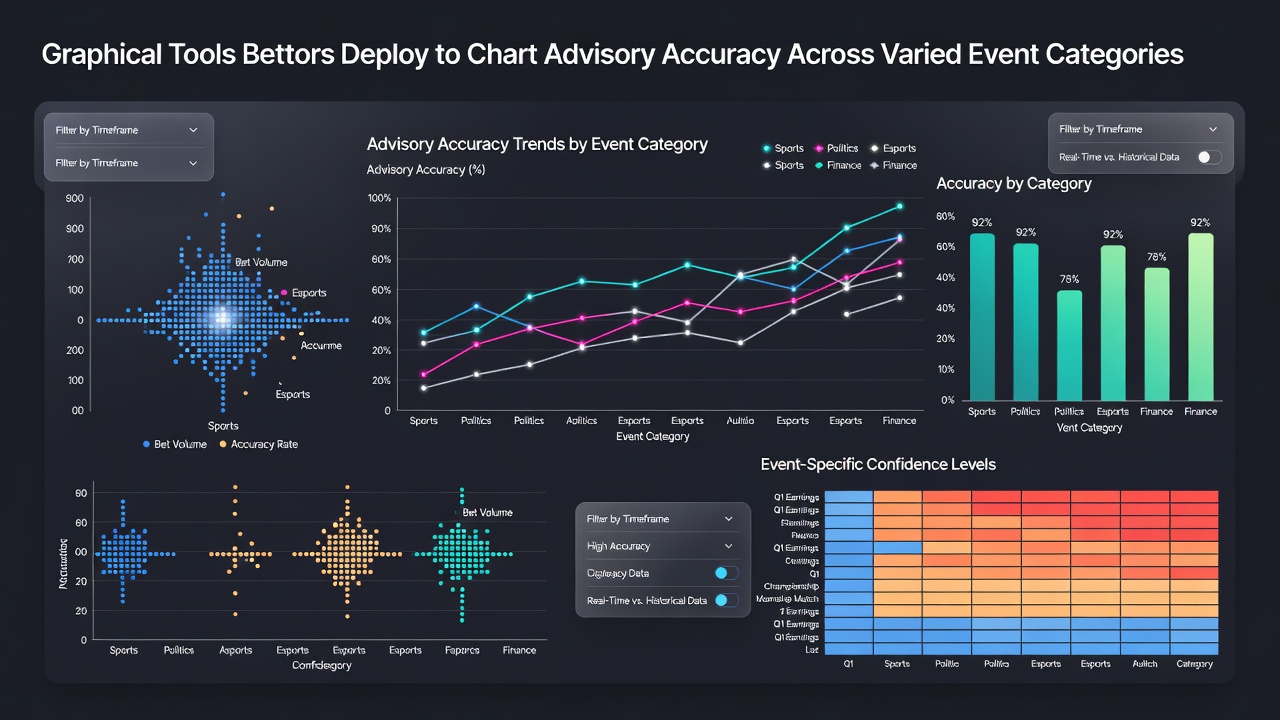
Graphical tools allow bettors to visualize tipster performance metrics such as strike rates, return on investment, and consistency levels across multiple event types including soccer matches, horse races, tennis tournaments, and basketball games. These platforms compile historical data into visual formats that reveal patterns in advisory accuracy, and observers note that users often combine line charts with scatter plots to compare outcomes from different categories simultaneously. Data from industry reports indicates that such visualizations help identify which advisors maintain steady results during high-volume periods like summer racing festivals or winter football leagues.
Core Visualization Methods in Accuracy Tracking
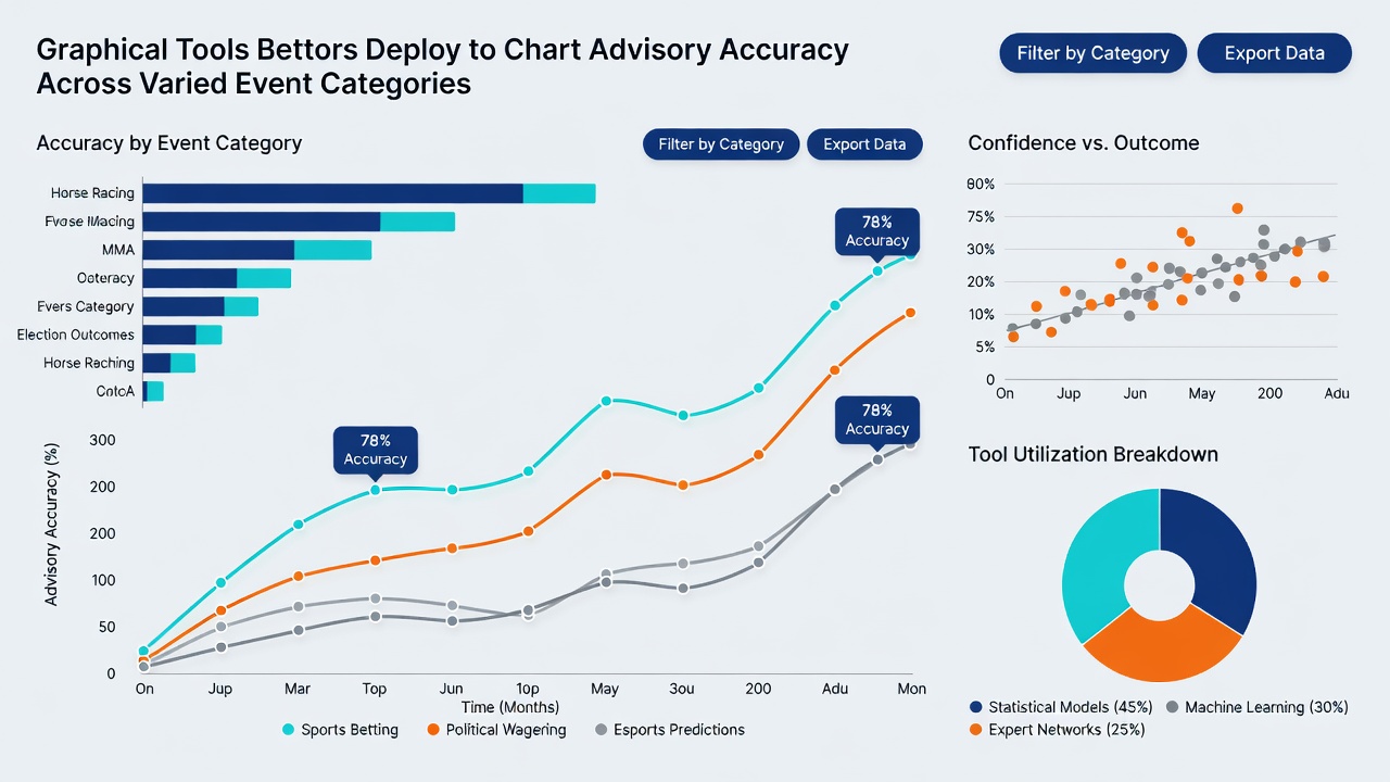
Line graphs form the foundation for many tracking systems because they display cumulative profit curves over extended timelines, and researchers have observed that connecting data points with smooth trajectories makes it easier to spot drawdown periods in both turf events and pitch-based competitions. Bar charts then break down performance by category, showing win percentages for flat races versus jumps meetings, while pie diagrams illustrate the distribution of successful selections across leagues and tracks. Those who study betting analytics often point out that heatmaps add another layer by color-coding accuracy levels according to variables like odds ranges or event timing, creating a quick reference for cross-category comparisons.
Software packages such as Excel extensions, Tableau dashboards, and specialized betting analytics programs integrate these elements into single interfaces, and figures from academic studies reveal that users who layer multiple chart types achieve clearer insights into tipster resilience during market fluctuations. In July 2026, several platforms introduced automated import features that pull live results from official racing authorities and league databases, reducing manual entry errors while maintaining real-time updates across varied event schedules.
Application Across Different Event Categories
Bettors apply these tools differently depending on the sport, since horse racing data tends to emphasize distance and ground conditions whereas soccer analysis focuses on team form and goal differentials. One common approach involves creating dual-axis charts that plot tipster strike rates against average odds for each category, allowing direct visual comparison between sprint tipsters and football predictors. Evidence from research institutions shows that such side-by-side displays help users detect whether an advisor's strength lies in low-odds accumulators or high-variance single selections.
Scatter plots prove particularly useful when mapping risk versus reward across tennis and basketball events, and data indicates that clusters of high-accuracy points often emerge in specific subcategories like Grand Slam matches or playoff games. Those who've examined long-term records note that combining these plots with trend lines highlights periods when advisory performance diverges from historical norms, especially during international tournaments that overlap with domestic racing calendars.
Integration with External Data Sources
Many graphical systems now connect directly to public datasets maintained by regulatory bodies and research organizations, and reports from the Responsible Gambling Council of Canada demonstrate how aggregated performance statistics improve the reliability of visual accuracy models. Users frequently import verified results from European sports data providers to populate radar charts that measure tipster consistency across soccer, rugby, and motorsport events in one view. This approach allows observers to track how advisory recommendations perform under different regulatory frameworks without relying solely on self-reported figures.
Additional layers come from academic repositories such as those maintained by the Australian Institute of Family Studies, where studies on gambling behavior include datasets that can be overlaid onto existing performance graphs. Researchers discovered that incorporating these external benchmarks helps normalize results across event categories that operate under varying fixture densities and prize structures.
Practical Implementation Patterns Observed in 2026
Throughout July 2026, betting communities documented increased adoption of interactive dashboards that let users filter results by time frame, odds band, and sport simultaneously. These tools generate automated alerts when accuracy metrics cross predefined thresholds, and analysts have recorded that such features reduce the time required to evaluate new tipster services. Multi-sport users particularly value stacked area charts that show cumulative contributions from each event category to overall portfolio performance, revealing whether diversification across racing and team sports produces more stable visual trends than concentrated approaches.
Custom color-coding schemes further assist in distinguishing between verified results and trial-period data, while export functions allow users to share annotated charts with peer groups for collaborative review. Records from platform analytics indicate steady growth in the number of bettors maintaining personal repositories that span multiple seasons and geographies.
Conclusion
Graphical tools continue to evolve as central components in systematic accuracy tracking, and their application across varied event categories provides structured methods for comparing advisory performance without subjective interpretation. As data integration improves and visualization options expand, users gain access to clearer representations of long-term patterns in tipster results across racing, football, and additional sports. These developments support ongoing efforts to monitor advisory consistency through objective visual analysis.